
Statistics
Parameters vs Statistic [With Examples]
Learn what parameters and statistics are, how to identify them easily, and how the notation symbols differ.
Sarah Thomas
Subject Matter Expert
College Success
12.13.2022 • 9 min read
Subject Matter Expert
Learn what statistics is and why it is important to society. We’ll list the types of statistics and data as well as the importance of the sampling methods.
In This Article
Statistics is a branch of mathematics that involves collecting, describing, and gaining insights from data.
While statistics has its origins in astronomy and probability theory, today, we use it in many fields, including:
Data science
Hard sciences like chemistry and biology
Social sciences like economics, political science, and psychology.
People also use statistics outside of academia. Teachers use statistics to grade their students; tech firms use statistical studies to understand their customers better and improve their products; doctors use statistics to measure the effectiveness of new treatments; gamers, gamblers, coaches, and sports fans use statistical analysis to study and predict the outcomes of all sorts of games. These are just a handful of examples. The applications of statistics are many!
One of Outlier's Statistics professors Ashley Carroll explains the basics of statistics like key terms and the process of a statistical study:
You can divide the field of statistics into two broad categories: descriptive statistics and inferential statistics.
Descriptive statistics is all about describing data. Let’s say you calculate the average or standard deviation of heights of a group of people; then you create a pie chart showing a breakdown of a population by race and ethnicity. You are engaging in descriptive statistics—you are using statistics for the sake of summarizing or describing some aspect of a data set.
In descriptive statistics, you will calculate population parameters and sample statistics, and you will also use parameters and statistics to create data visualizations such as:
Bar charts Dot plots Other graphs and figures
Inferential statistics—or statistical inference—is when statisticians use sample data to gain insights about a population. Say you’re a medical researcher interested in the percentage of people who will experience negative side effects after taking a new drug.
Rather than testing the drug on everyone who might be interested in taking it, you would:
Collect a random sample of patients
Collect data from those patients
Make inferences about the population using the sample set of data
Some statistical methods used in inferential statistics are:
Randomized controlled trials
Hypothesis testing
Linear regression
Analysis of variance (ANOVA)
Forecasting models
Logit models
Probit models

In statistics, we divide data into two main categories: categorical data—also called qualitative data—and numerical data—also called quantitative data.
Categorical data gets further subdivided into nominal and ordinal data. Then numerical data gets further subdivided into discrete and continuous data.
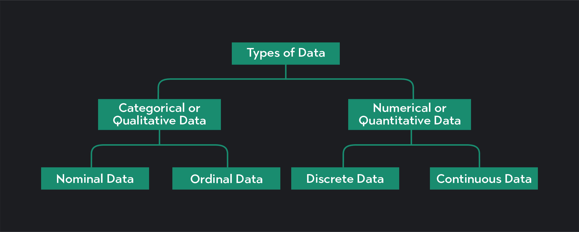
As the name suggests, categorical data are data that gets sorted into groups or categories using labels. If I flip a coin, I can represent the outcome of the coin flip using categorical data: heads or tails. If you tick a box on a form indicating your gender, race, or political affiliation, you are sorting yourself into a categorical data set.
We can further divide categorical data into nominal and ordinal data.
Nominal data is categorical data with no particular order. The categories created by a coin flip—heads or tails—are an example of nominal data because the categories have no particular rank or order.
Ordinal data is categorical data where the categories are ranked in some meaningful way. If you ask a group of people their likelihood of seeing a new movie, and you categorize their answers as very likely, likely, neutral, unlikely, or very unlikely, the data you collect would be considered ordinal data. Similarly, if you were to ask viewers of a movie to rank the movie by giving it anywhere from 1 to 5 stars, their answers would also be ordinal data.
Numerical data takes the form of numbers that we use to count or measure. You are collecting numerical data—data that represent counts or measurements if you collect data such as:
The speed at which athletes complete a 400-meter race
People’s age or income
Daily temperatures
Numerical data is further divided into discrete and continuous data.
Discrete data can only take on distinct and countable values. In theory, you should always be able to count the number of possible values in a discrete data set. If you collect data on the number of goals scored by teams in the World Cup, you are collecting discrete data. Teams can’t score 5.8 or 12.3 goals per match, they can only score whole and countable values.
Continuous data can take on any value within a range, which means the possible values in a continuous data set are infinite. If you were to measure the amount of distance covered by players in the World Cup, you would be collecting continuous data. Players often run anywhere between 3 and 10 miles per match, but a player might run 4.7 miles or 9.83 miles or any number within some range. Continuous data typically requires a measuring tool (like a ruler or a stopwatch) to measure it.
One additional category of data exists that bridges the categorical and numerical categories. This category consists of proportions and percentages. We often bundle proportions and percentages into the quantitative data category. But they deserve some distinction since they often serve as a link between categorical and numerical data. For example, if you ask a group of potential voters to name the candidate they are planning to vote for, you would be collecting categorical data. You could, however, transform that data into quantitative data by calculating the percentage of people who are likely to vote for each candidate.
Data visualization and data representation play an important role in descriptive statistics.
Some of the most commonly used forms of data representation are:
A frequency table is a table that organizes categorical data into two columns, with the first column showing each category in the data set and the second column showing the frequency with which each category appears in the data.
A bar chart—or bar graph—is a visual representation of a frequency table. It is a graph that plots categories along the horizontal axis and frequencies on the vertical axis. We see the frequencies for each category as bars with equal widths. The heights of the bars vary, corresponding to the frequency with which each category appears in the data.
A frequency distribution is similar to a frequency table, but we use it for numerical data. Because we cannot cleanly divide numerical data into categories, the first step in creating a frequency distribution is dividing numerical data into classes covering the full range of your data.
For example, if you have numerical data on the age of employees, you might divide the data into 5-year intervals—20-24 years old, 25-39 years old, etc. You then sort your data into each class and create a table showing each class and the number of data points that fall into each of them. You can also add a third column to the table showing the relative frequency for each class. The relative frequency equals the percentage of data points that are in each class.
A histogram is a visual representation of a frequency distribution. Like a bar chart, a histogram plots classes of numerical data along the horizontal axis and frequencies on the vertical axis. Bars of equal width drawn adjacent to each other represent each class of data. The height of each bar represents the frequency of a particular class.
Pie charts are another great way to visualize data. A pie chart is a circle divided into different colored wedges or slices. Each slice represents a category or class in your data set, and the size of each wedge varies according to the proportion or relative frequency of each category or class.
A scatter plot is a graph used to plot two separate data sets, each with the same number of data points. To use a scatter plot, each data point in one of the data sets must be associated with only one data point in the other.
Say you are studying a group of 100 people, and you collect data on their height and weight. You could create a scatter plot showing each person's height on one axis of the graph and their weights on the opposing axis. A scatter plot is a useful way of visualizing the relationship—or correlation—between two variables.
The graph of a probability distribution shows the probability of different outcomes that could occur as the result of a random experiment. Statisticians frequently use probability distributions in statistical inference to show the probability that a sample statistic is in line with a hypothesis about a population parameter. Probability distributions can be discrete or continuous depending on whether the data you are working with is discrete or continuous.
Discrete probability distributions you will likely come across in introductory statistics are:
The Bernoulli distribution
Poisson distribution
Dr. Olanrewaju Michael Akande of Duke University discusses binomial distribution:
Commonly used continuous probability distributions include:
The uniform distribution
The Chi-squared distribution
Dr. Olanrewaju Michael Akande also explains normal distribution:
AnnMaria De Mars is one of Forbes' “40 Women to Watch Over 40," and she breaks down chi-square distribution:
In inferential statistics, statisticians draw conclusions about a population from a sample. For these insights to be reliable and informative, you must use a sample that represents the larger population you are studying.
Statisticians use several “sampling techniques”—or sampling methods—to ensure that this is the case.
Even when we follow the best sampling methods, statistical results can still result in inaccuracies. Sampling errors cause these inaccuracies. These are errors that occur by chance during data collection.
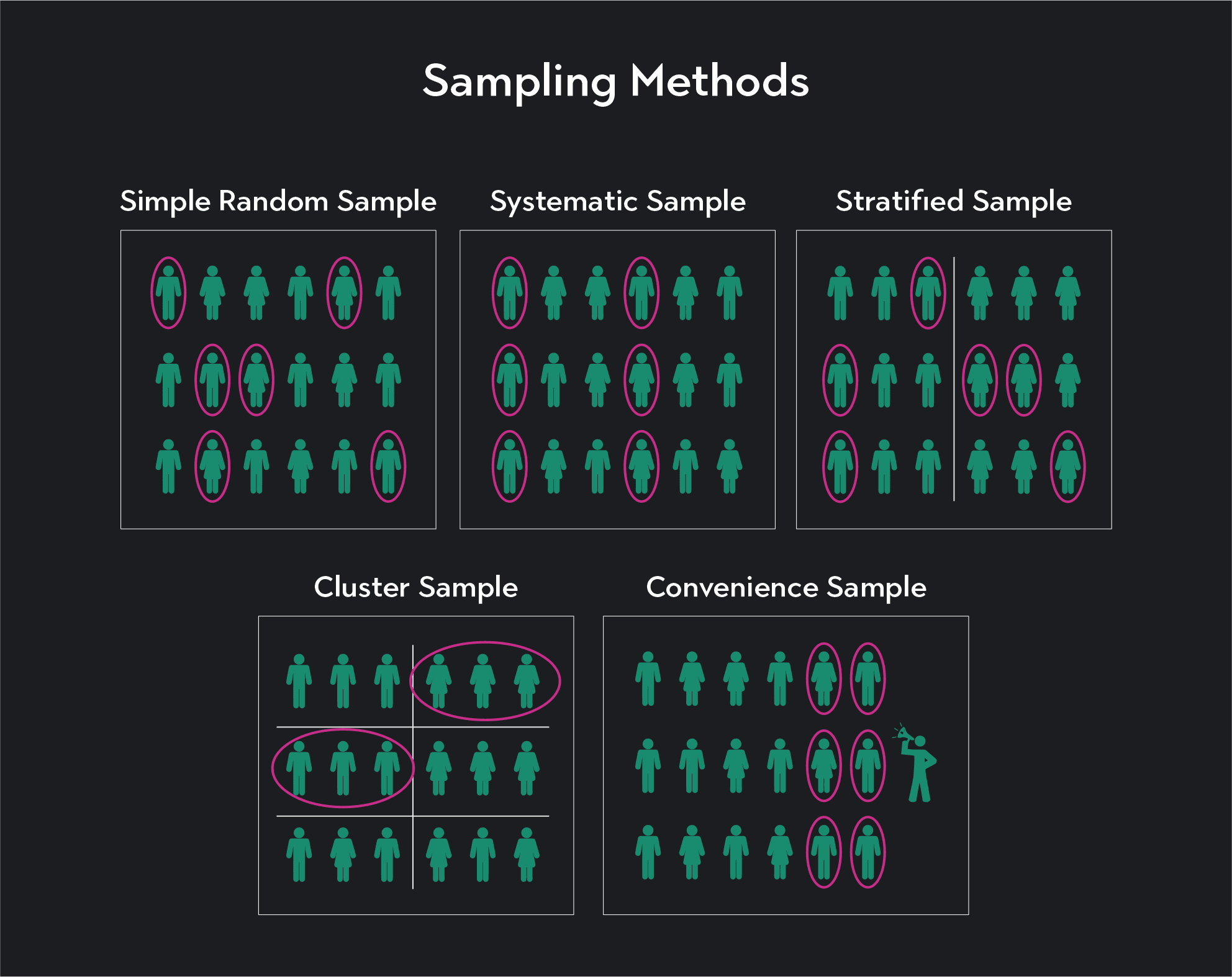
Commonly used sampling techniques include:
We consider a simple random sample the gold standard of sampling. In a simple random sample, a subset of the population is randomly selected into the sample. Each member of the population has an equal chance of being selected into the sample.
In a systematic sample, the researcher develops a system for selecting their sample. Usually, they assign a number to members of the population. The researcher then selects every subject in the population into the sample. If you have 100 people in the population you are studying, you might select every 10th person into the sample.
In a stratified sample, we first divide the population into sub-groups according to some common characteristics like gender, race, or age. The statistician then randomly selects sample subjects from each group. This helps to ensure that subjects with a particular characteristic are not over-sampled.
We first divide the population into clusters in a cluster sample. Then we randomly select whole clusters into the sample. Unlike stratified sampling, clustering should occur based on some categorization independent of the characteristics you are trying to study.
Convenience sampling is the least reliable form of sampling, but as the name suggests, it is the most convenient. A convenience sample consists of sample data that is simply easy to collect. If you want to know whether people like a particular politician and you sample the first 50 people you run into, then you are using a convenience sample.
Outlier (from the co-founder of MasterClass) has brought together some of the world's best instructors, game designers, and filmmakers to create the future of online college.
Check out these related courses:


Statistics
Learn what parameters and statistics are, how to identify them easily, and how the notation symbols differ.
Subject Matter Expert

Statistics
This article explains what a test statistic is, how to complete one with formulas, and how to find the value for t-tests.
Subject Matter Expert

Statistics
Learn how to find critical value, its importance, the different systems, and the steps to follow when calculating it.
Subject Matter Expert