In This Article:
What Is a Box Plot?
How to Construct a Box Plot in 7 Steps
What Is a Box Plot?
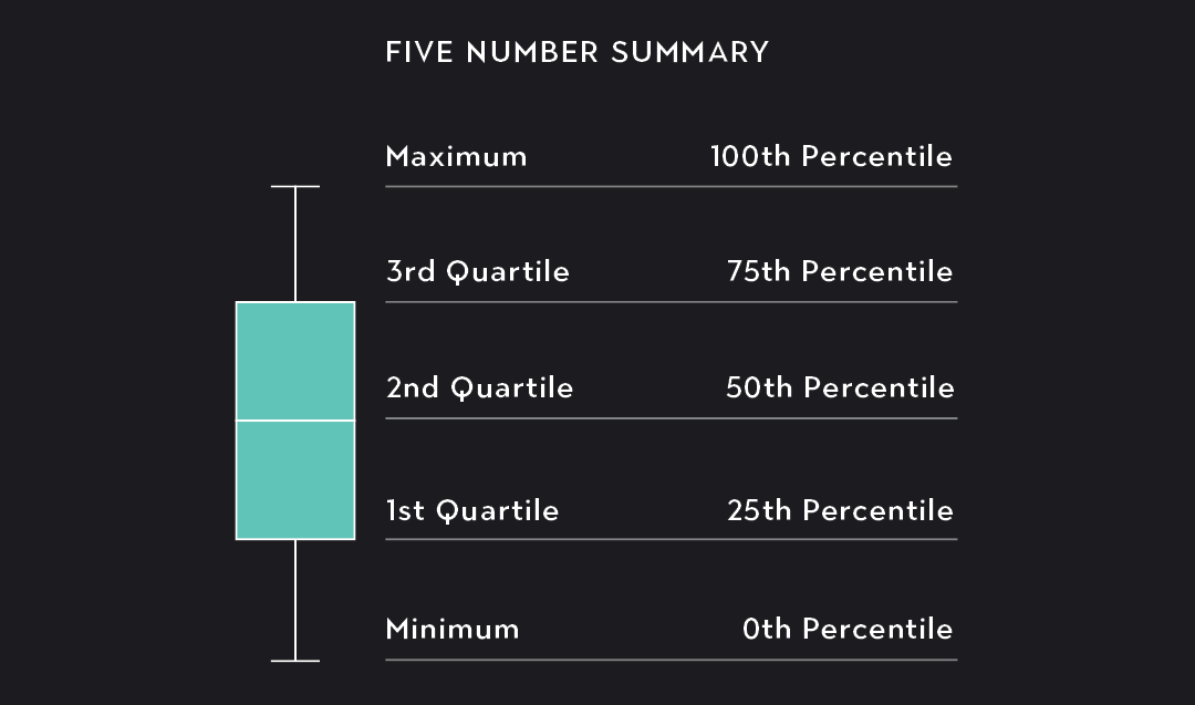
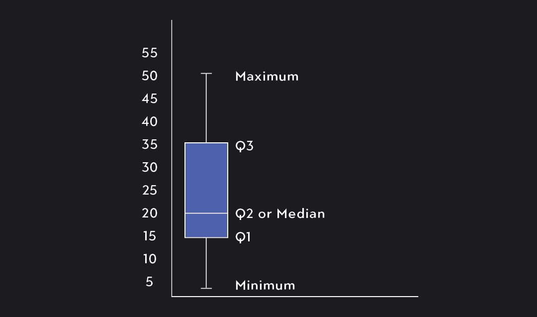
A box plot, sometimes called a box and whisker plot, is a graph of the five-number summary of a data set. This graph has two components. The first is a box marking off the 1st quartile (25th percentile), 2nd quartile (the median), and 3rd quartile (75th percentile) of the data. The second component consists of two lines extending outward from the box to mark the minimum and maximum values.
As you can see in the figure below, the five-number summary divides the data into four buckets (or quartiles), each containing 25 percent of the data. You can draw a box plot vertically, as shown in the figure below, or horizontally along a number line.
Benefits of a Box Plot
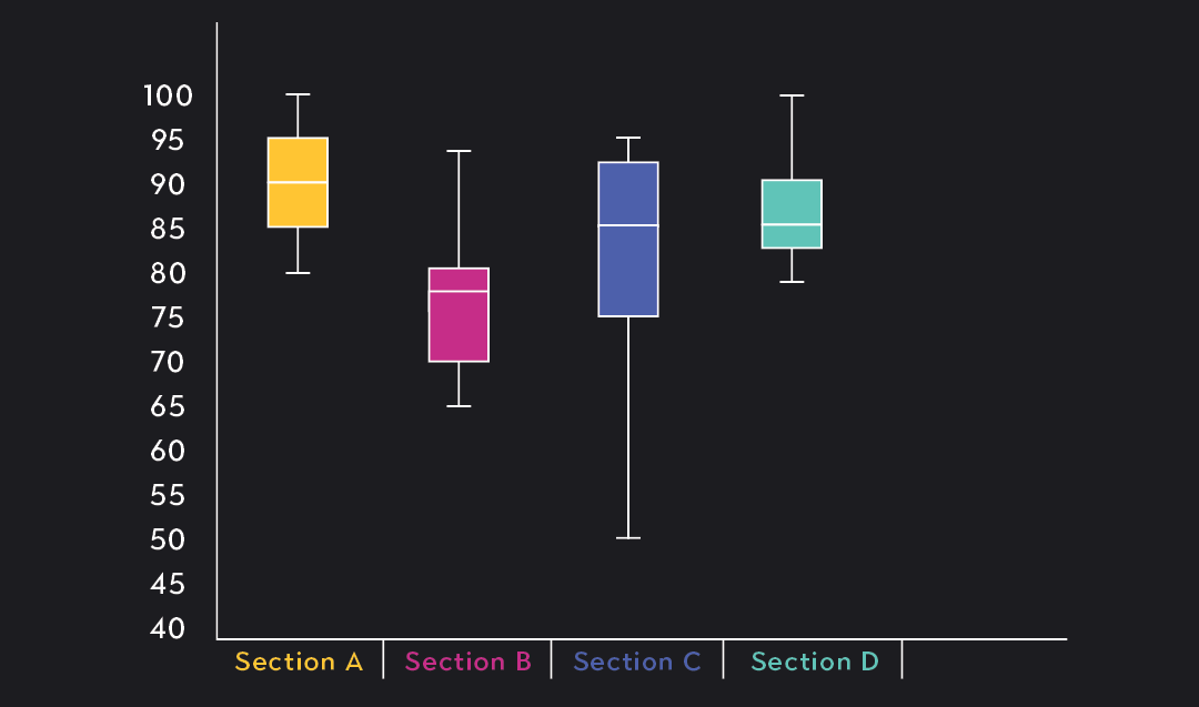
Box plots are a great visual tool for quickly conveying the center, spread, and skewness of data. They’re often used to provide a high-level comparison of the distribution of data across multiple samples or data sets that share the same units of measurement.
Because a box plot is only anchored by five points (the five-number summary), it does not convey more detailed information about the shape of the distribution. To visualize the entire distribution, you should use a histogram or a probability density graph.
Box Plot Variations
A variation of the box plot is one in which potential outliers are separated from the rest of the data. The outliers are marked by a circle or a dot on the graph. If your data contains extreme outliers, this is a better version of the box plot to use.
How to Construct a Box Plot in 7 Steps
Let’s say you have the following data consisting of 18 data points (n=18).
You can construct a box plot in 7 easy steps.
Step 1. Arrange the data from smallest to largest.
Step 2. Find the minimum and maximum of the data.
The minimum and the maximum are simply the smallest and largest values in your data. These will eventually be the endpoints of your whiskers.
If you have outliers and want to exclude them, simply ignore the outliers and select the next smallest or largest values as your maximum and minimum.
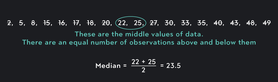
Step 3. Find the median.
To find the median, you look for the middle value of your data. If the total number of data points is odd, this is straightforward, as there will only be one number that sits in the middle. If the total number of data points is even, as is the case here, we need to find the middle two data points and then average them.
Step 4. Find Q1.
Now that you have the minimum, maximum, and median, you need to find the first quartile (Q1) and the third quartile (Q3) of the data. Once you have these, you’ll have your five-number summary.
The first quartile is the same thing as the 25th percentile of the data. To find it, we use the locator formula below. This formula lets us find the value that divides the bottom quarter of the data from the upper three-quarters (or 75 percent) of the data.
L=(100k)n=(10025)⋅18=4.5 When L is a whole number, you can calculate Q1 by taking the average of the Lth value in your data and the (Lth +1) value.
When L is not a whole number, you round L up to the next whole number to locate Q1.
Since our value for L is not a whole number, we round up from 4.5 and look for the 5th value in the data set.
Note that there are different ways to calculate the percentiles of data. Depending on the method you use, your calculation for Q1 and Q3 might be slightly different.
Step 5. Find Q3.
The third quartile is the same thing as the 75th percentile. Using the same method we used in Step 4, we can find Q3.
L=(100k)n=(10075)⋅18=13.5 Because L is once again not a whole number, we round up and look for the 14th value in the data set.
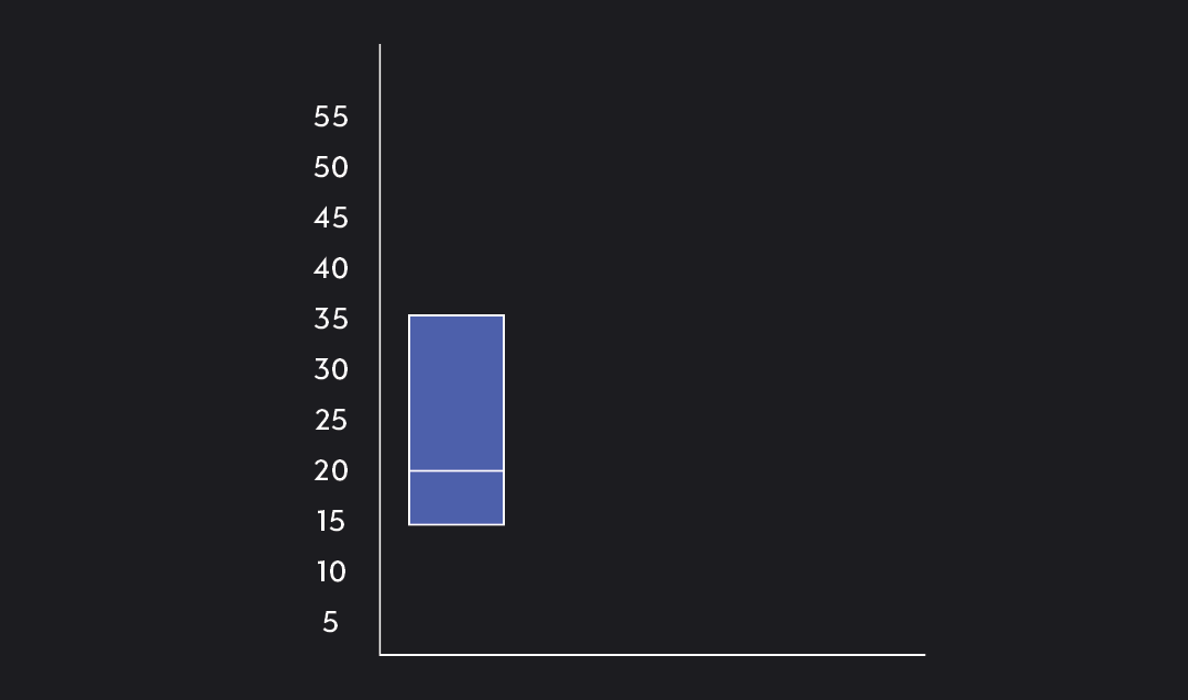
Step 6. Construct the box using Q1, Q2, and Q3.
We now have a five-number summary of the data and can start constructing the box plot.
Five-Number Summary:
Min. = 2
Q1 = 16
Median = 23.5
Q3 = 35
Max = 49
Q1 marks the lower-end of the box, and Q3 marks the upper-end. We add a horizontal bar within the box to show the data’s median, or 50th percentile.
Step 7. Add the whiskers!
The last step is to add the whiskers. Simply draw one line connecting the bottom of the box to the minimum value of the data and another line connecting the top-end of the box to the maximum value.
Voila! You have your box plot.
Explore Outlier's Award-Winning For-Credit Courses
Outlier (from the co-founder of MasterClass) has brought together some of the world's best instructors, game designers, and filmmakers to create the future of online college.
Check out these related courses: