Overview
Marginal Rate of Substitution (MRS)
How do you compare one indifference curve to another?
Are indifference curves realistic?
Overview
Let’s say you have a little brother who’s an avid consumer of two things: chocolate bars and gummy bears. It might not be apparent at first glance that there’s any relationship between how much he likes one compared to the other. However, the field of microeconomics has given us a number of tools designed specifically to illuminate the complicated and often hidden relationships which shape the ways in which people not only consume goods, but also how they make choices between more abstract things, such as their preference between leisure (hours of free time) and the income gained from working. One of the foundational tools of the discipline is the indifference curve, which is defined as a curve connecting different combinations of two goods that each produce the same level of utility (or satisfaction) for a particular individual.
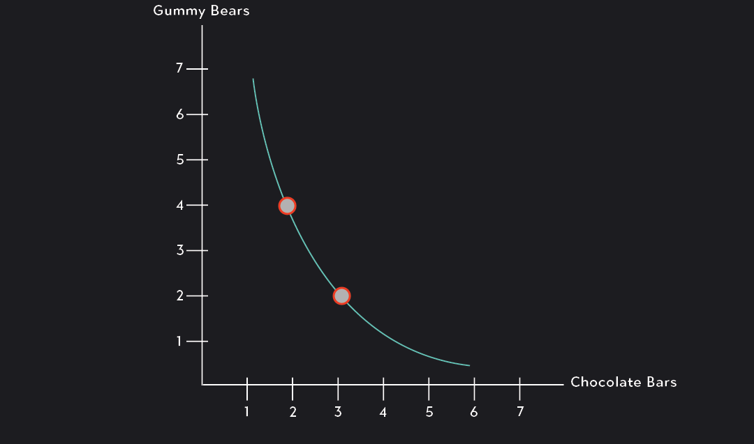
Take for example, the indifference curve below, which connects different combinations of chocolate bars and gummy bears that provide him with the exact same level of utility. According to this indifference curve, 3 chocolate bars and 2 packs of gummy bears is just as good as 2 chocolate bars and 4 packs of gummy bears. If you asked your brother to choose between any of the combinations along this curve, he’d simply be indifferent.
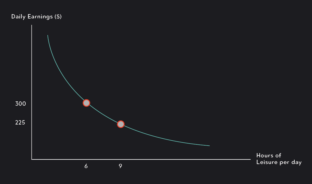
Likewise, an analysis of the figure below shows us that Individual A is indifferent between having 9 hours of leisure in a day with daily earnings of $225 and having 6 hours of leisure per day with daily earnings of $300.
Indifference curves are subjective
Indifference curves represent individual tastes and preferences. They’re subjective in the sense that they will look different from person to person. You might look at the indifference curve in the example above and feel differently about the amount of chocolate you want relative to packs of gummy bears. If that’s the case, the indifference curves representing your preferences would look different from those of your hypothetical brother.
What does the shape of an indifference curve tell us?
One thing to notice when you’re analyzing an indifference curve is its slope. The slope of an indifference curve at any given point along the curve is called the marginal rate of substitution (MRS). Remember, a slope can be approximated as the change in Y over the change in X, so we can interpret the marginal rate of substitution as the amount of Good Y that a person is willing to give up in exchange for one additional unit of Good X.
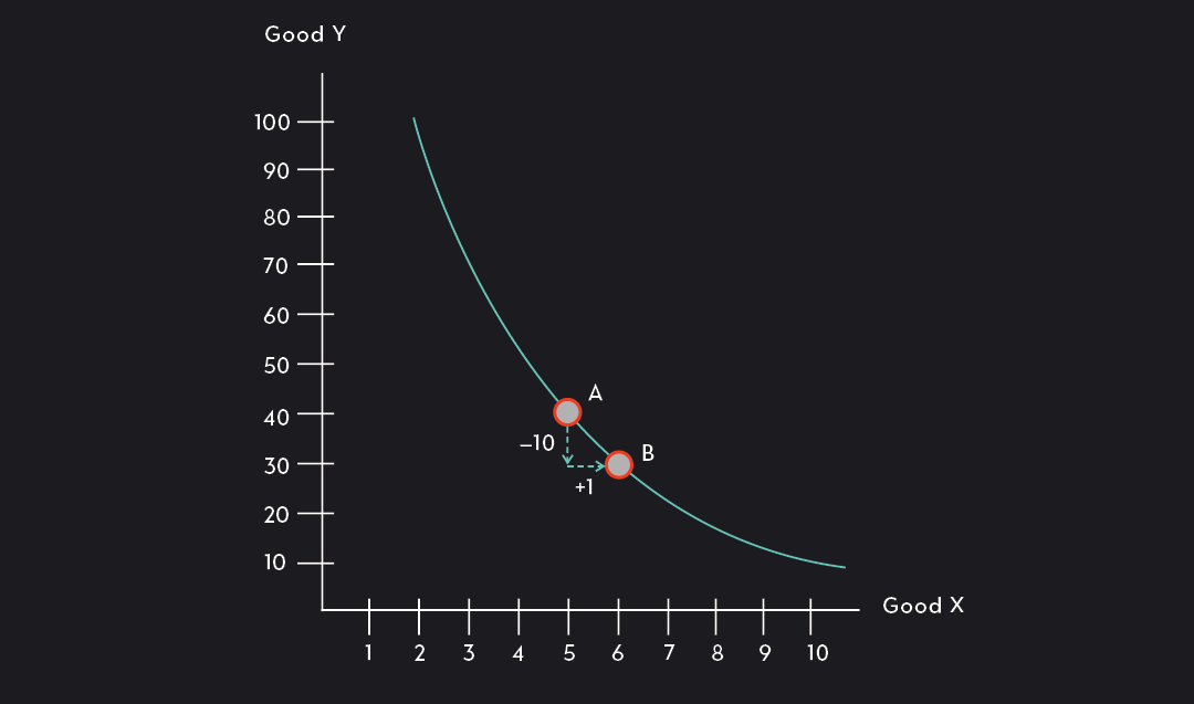
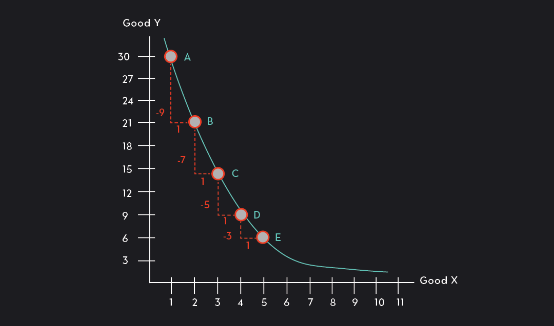
In the figure below, the marginal rate of substitution at Point A is 10. As you move from Point A to Point B, you are willing to give up 10 units of Good Y (40 units to 30 units) for one additional unit of Good X (5 units to 6 units). Keep in mind that this way of calculating the MRS is just an approximation. To find the exact MRS you would use calculus to calculate the derivative at Point A.
Marginal Rate of Substitution (MRS)
The Marginal Rate of Substitution (MRS) is the slope of an indifference curve at a given point. The MRS can be approximated and interpreted as the amount of a good that an individual is willing to part with in exchange for one additional unit of another while remaining on the same indifference curve.
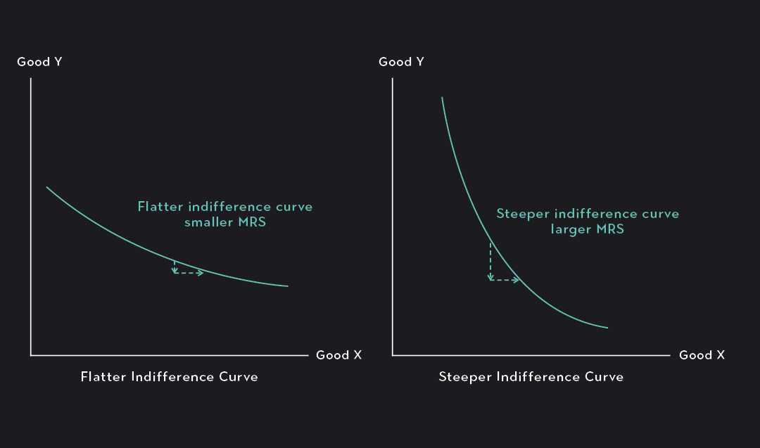
Knowing what a marginal rate of substitution is, we can learn more about the overall shape of indifference curves. A relatively flat indifference curve (like the one shown in the figure on the left below) demonstrates a lower overall willingness to give up the good on the y-axis in exchange for more of the good on the x-axis. The individual whose preferences are represented on the left would have to be compensated with a lot of Good X just to part with a single unit of Good Y. Conversely, a relatively steep indifference curve demonstrates a stronger overall willingness to give up some of the good on the y-axis in exchange for more of the good on the x-axis. The individual whose preferences are represented on the right is willing to give up a relatively large amount of Good Y just to get one additional unit of Good X.
Interpreting the MRS
A high marginal rate of substitution (a steeper slope on the indifference curve) indicates that an individual is willing to give up a large amount of the good plotted on the y-axis in exchange for just one additional unit of the good plotted along the x-axis.
A low marginal rate of substitution (a flatter slope on the indifference curve) indicates that an individual is only willing to give up a small amount of the good plotted on the y-axis in exchange for just one additional unit of the good plotted along the x-axis. In other words, the lower MRS indicates more of a reluctance to part with the good plotted on the y-axis.
All of the indifference curves so far, whether steep or flat, have been convex to the origin. This means the curve is bowed outwards away from the origin, and that the curve gets steeper as it approaches higher and higher values of Good Y and flatter as it approaches higher and higher values of Good X. Almost all of the indifference curves you see will have this general shape.
It makes sense that an indifference curve would be convex, rather than concave, to the origin if you make the following assumption:
When you have a lot of Good Y but very little Good X, you are more willing to part with Good Y for an additional unit of Good X (the MRS will be high and the indifference curve will be steep). On the other hand, if you have plenty of Good X but very little of Good Y, you will be less willing to give up a unit of Good Y for one additional unit of Good X (the MRS will be lower and the indifference curve flatter).
How do you compare one indifference curve to another?
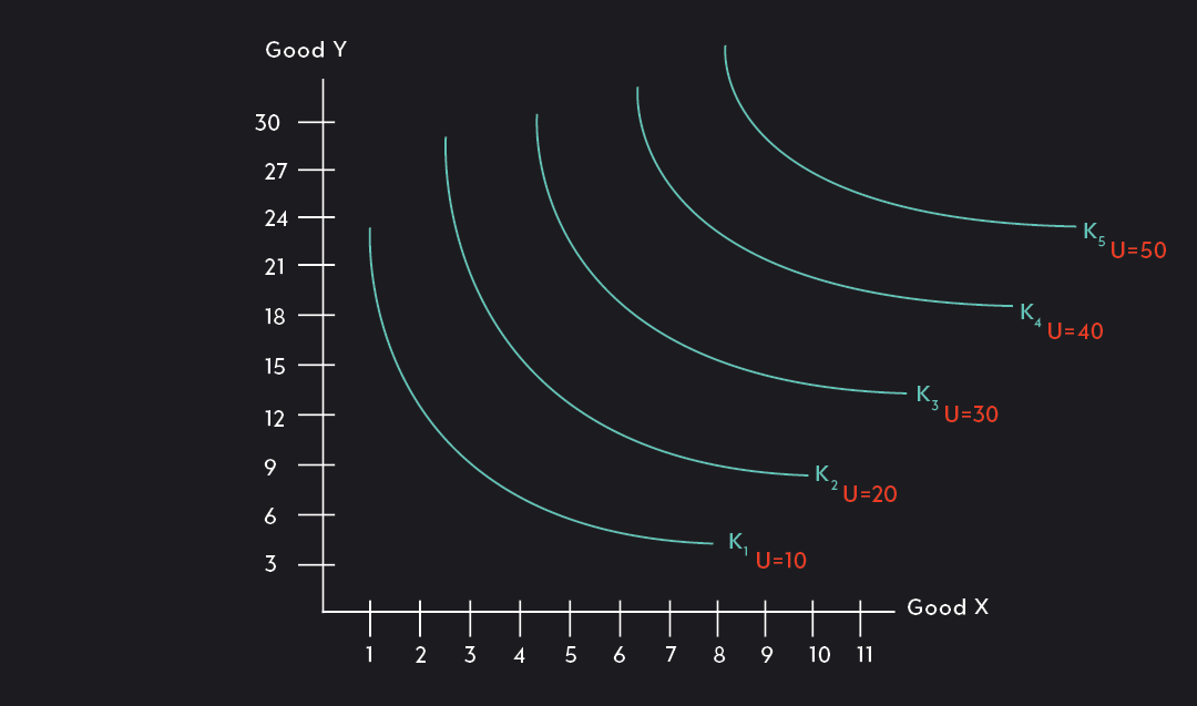
So far we have only looked at one indifference curve at a time, but below you can see what a typical graph of indifference curves looks like. You’ll notice that there are multiple indifference curves on this graph. Each indifference curve (IC1, IC2,...) represents combinations of goods that provide the same amount of utility, but the level of utility varies from curve to curve. As you move towards the right corner of the graph, each indifference curve represents higher and higher levels of utility. An indifference curve above and to the right of another indifference curve will always be preferred. To understand why this is the case, compare combinations of goods between any two indifference curves in the graph. Combinations along the indifference curve above and to the right will always offer a better deal than those on the lower curve.
Are Indifference Curves Realistic?
Indifference curves are a useful tool for modeling individual preferences, but like all economic models, indifference curves are not always realistic and make strong assumptions about the way people behave which do not always hold up against empirical study of the manner in which individuals actually behave. Some applications of indifference curves have been criticized for deviating too far from how people act in real life to be useful.
When using indifference curves, economists often make the following strong assumptions regarding preferences, regardless of their distance from lived behavior:
Transitive preferences. If a person prefers A to B and B to C, then they must prefer A to C.
Complete preferences. People always have a clear sense of what their preferences are and are never indecisive.
Behavior in line with preferences. People always act in accordance with their preferences. Once preferences are established they don’t change from moment to moment.
Explore Outlier's Award-Winning For-Credit Courses
Outlier (from the co-founder of MasterClass) has brought together some of the world's best instructors, game designers, and filmmakers to create the future of online college.
Check out these related courses: